Canvas tour
A guided tour of the workflow editor: the left panel's Chat, Blocks and Plan tabs, the canvas itself, the Inspector, and the topbar.
The editor has four regions. Everything else in this section drills into one of them.
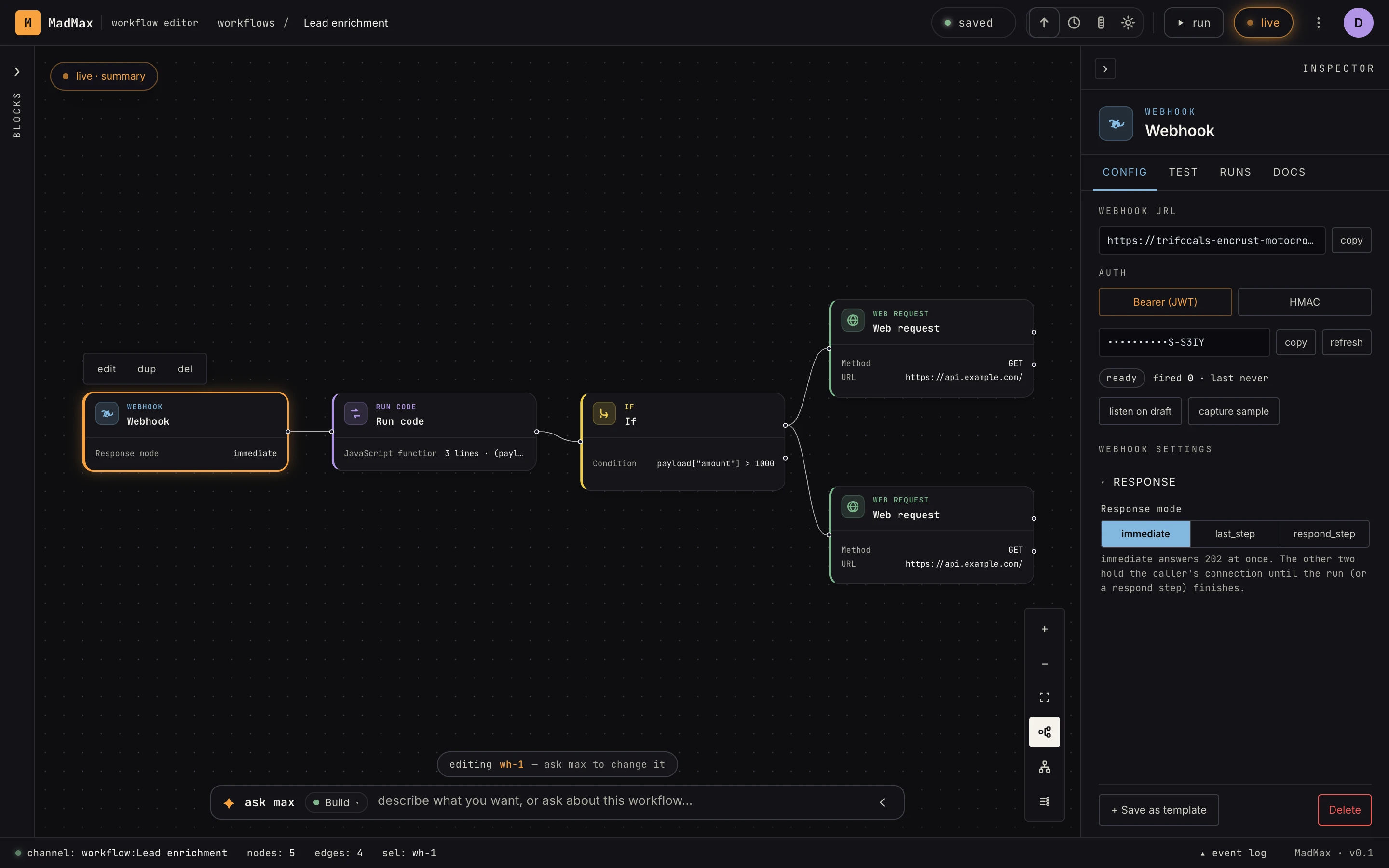 Left panel for chat and blocks, canvas in the middle, Inspector on the right, workflow controls in the topbar.
The left panel — Chat · Blocks · Plan
One column, three tabs:
- Chat — the AI. Always available; the tabs only change what's
displayed, never the conversation. The chat can also collapse to a
slim command bar at the bottom (the
›button) so Blocks or Plan can take the column. - Blocks — the palette: every step you can drag onto the canvas, in three tabs of its own (details).
- Plan — during an AI build, the live plan: each step's intent, its verification state, and the verified counter (details).
The canvas
The graph itself. Scroll to zoom, hold space and drag to pan, click a node to select it, drag from a port to connect. Hovering a node reveals its context row — edit · dup · del. The rail of buttons on the right edge holds view tools (details).
The Inspector
Click any node and its configuration opens on the right: the step's fields with inline hints, an error-handling panel, and a Test tab that runs just that step (details).
The topbar
Left to right: the saved chip (autosave state), quick icons for snapshot history / fit / tweaks, the run button (fires the workflow once, on demand), the Activate / off toggle (what makes triggers live), the workflow menu (⋮ — details), and your account.